“Now, listen up. When a person first looks at something you have written it should be something that looks inviting to read. Easy-to-read. When he looks at your page of copy he should be drawn to your copy like a convict is to a Penthouse Magazine.”
Gary Halbert, The Boron Letters
Gary Halbert was never one for subtleties… So how do we apply this advice from one of the best copywriters that ever lived?
A lot of website design is done for us. LeadPages, Wix, Click Funnels, they make our lives easier. E-mail is another story.
I understood this in the beginning but Neville Medhora really helped this point hit home when I took his Copywriting Course. Good spacing is a thing but don’t forget extras like using different colors, underlining, and using bold and italic text.
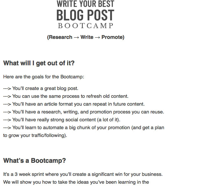
Take a look at one of his e-mails.

Neville uses a headline, sub-headlines, bold letters, and little arrow thingies (and this is one of his more simple e-mails). He regularly uses a lot of little fun cartoon drawings, graphics, photos, and he plays with paragraph alignment. These are all tips that make your e-mails more inviting.
If you don’t follow Gary’s advice the opposite will happen. Instead of drawing in your readers you will repel them.
Adam